Pivot Design System
Client - Prosperity LMS
Ziiva’s Properity LMS is a powerful, flexible Learning Management System designed to adapt to the unique needs of each organization.
It allows companies to host the platform on their own servers under a perpetual license, giving them full ownership and control of the system.
Properity LMS is built to streamline training operations, reduce administrative workload, and automate repetitive tasks—so teams can focus on learning outcomes rather than platform management.
The Challenge
Refresh the Prosperity LMS experience while keeping front-end development impact as low as possible.
Create a flexible component library that supports fast, consistent customization across clients.
The Goal
Attract new customers and drive revenue growth.
Elevate current user satisfaction by 60% through a better product experience.
Strengthen loyalty and retention by 25%.
Audit - Breaking down the issues
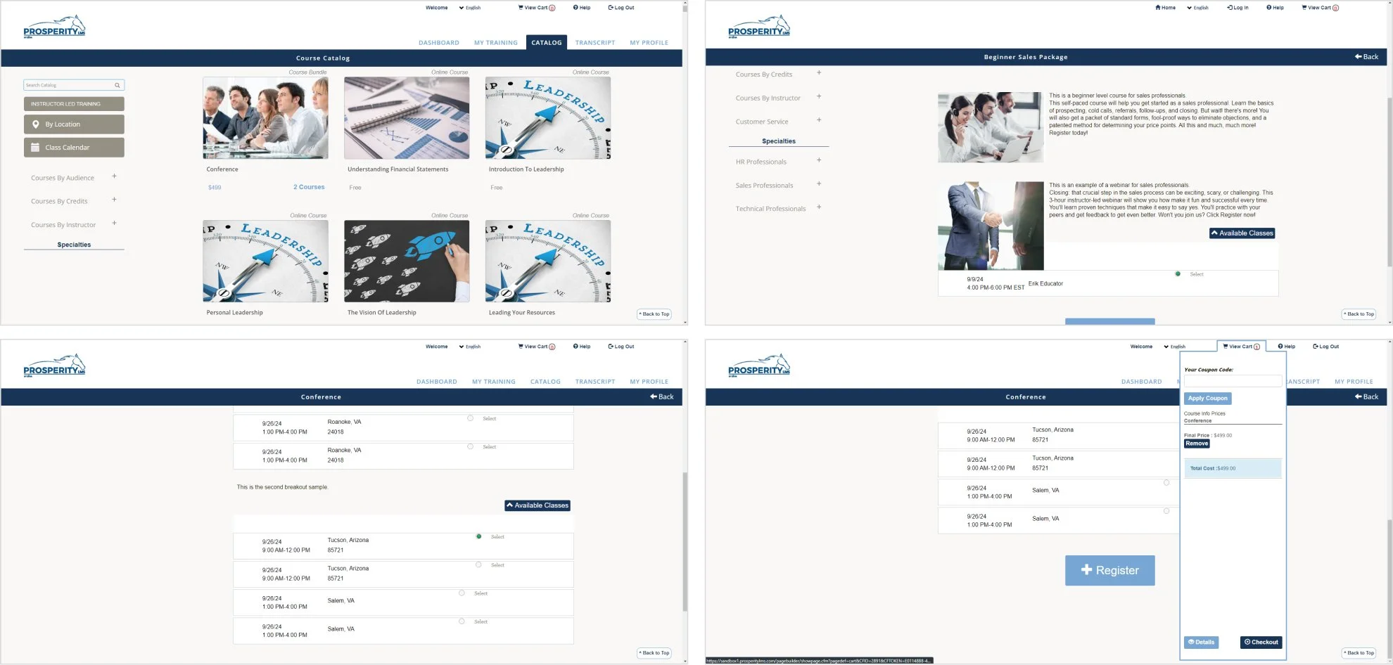
We collaborated with the client’s team to assess the existing platform and map its pain points. Prosperity LMS was originally built over a decade ago and has since expanded through continuous, client-specific feature additions. This approach supported business needs—but gradually eroded consistency in the UI and overall user experience.
The audit highlighted the following challenges:
Usability issues affecting navigation and task completion
Missing UI library and absence of reusable patterns
Components that varied in style and behavior across the platform
A dated look and feel that no longer matched modern expectations
Inconsistencies in layout, typography, and interaction across the system
Design System Benefits
Implementing a Design System will help us modernize a platform that has been in the market for over 10 years, bringing consistency, scalability, and a refreshed user experience.
Problem
Visual inconsistency
Long development cycles
Communication ambiguities
Limited scalability
Solution
Clear component guidelines: Define appearance and behavior standards to ensure every component looks and works consistently
Reusable component libraries: Build a shared, modular library of UI components to speed up design and development.
Unified naming conventions: Establish a single, cross-team nomenclature so everyone speaks the same product language.
Scalable flow creation: Reuse existing components to design new user flows quickly and reliably.
Pivot Design System
We've named our design system Pivot. This name powerfully reflects its core function and our vision for how you'll build with it.
A pivot is a central point around which something turns or changes. In the context of our design system, Pivot signifies the flexible, central hub from which all your designs will effortlessly shift, adapt, and reconfigure.
Pivot DS Principles
The Pivot Design System is built upon core principles that guide our design and development, ensuring consistent, adaptable, and user-centric experiences.
Customizable
Pivot adapts to any client's brand and business needs. It ensures deep personalization, integrating unique identities while maintaining product consistency and a unified user experience.
Clarity
Clarity ensures every element and instruction is easy to understand. We eliminate ambiguity, creating intuitive interactions and clear documentation for confident navigation by all users.
Flexible
Designed for continuous improvement, Pivot components are like building bricks. Mix them to construct any interface, from simple forms to complex dashboards, rapidly adapting to new requirements.
Accesible
Design should be for everyone. Our Accessibility commitment means crafting functional and delightful designs for diverse audiences, ensuring inclusive and usable experiences for all.
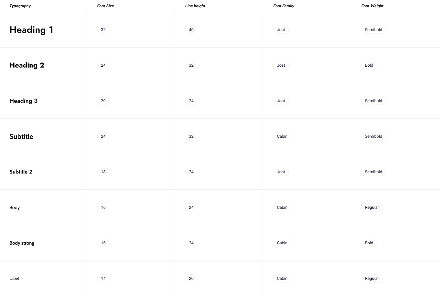
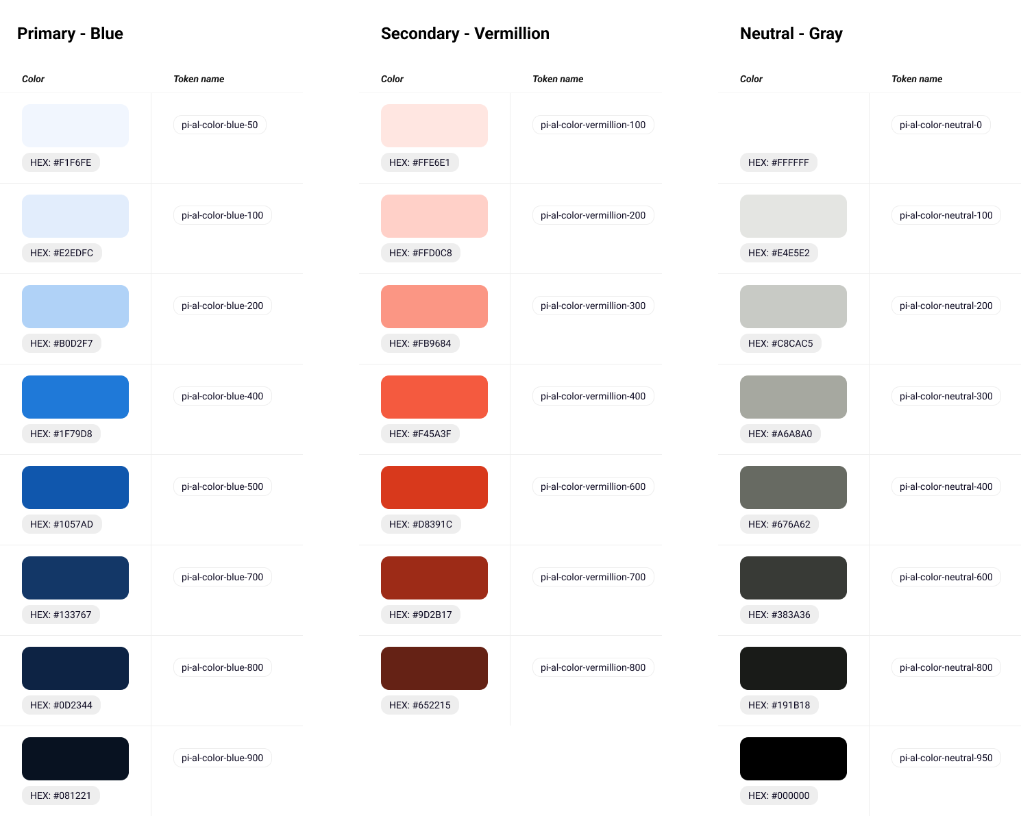
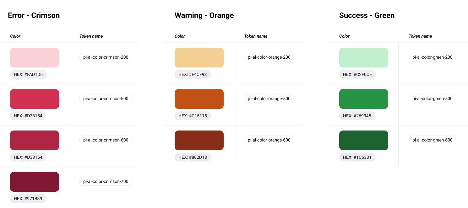
Design Foundations
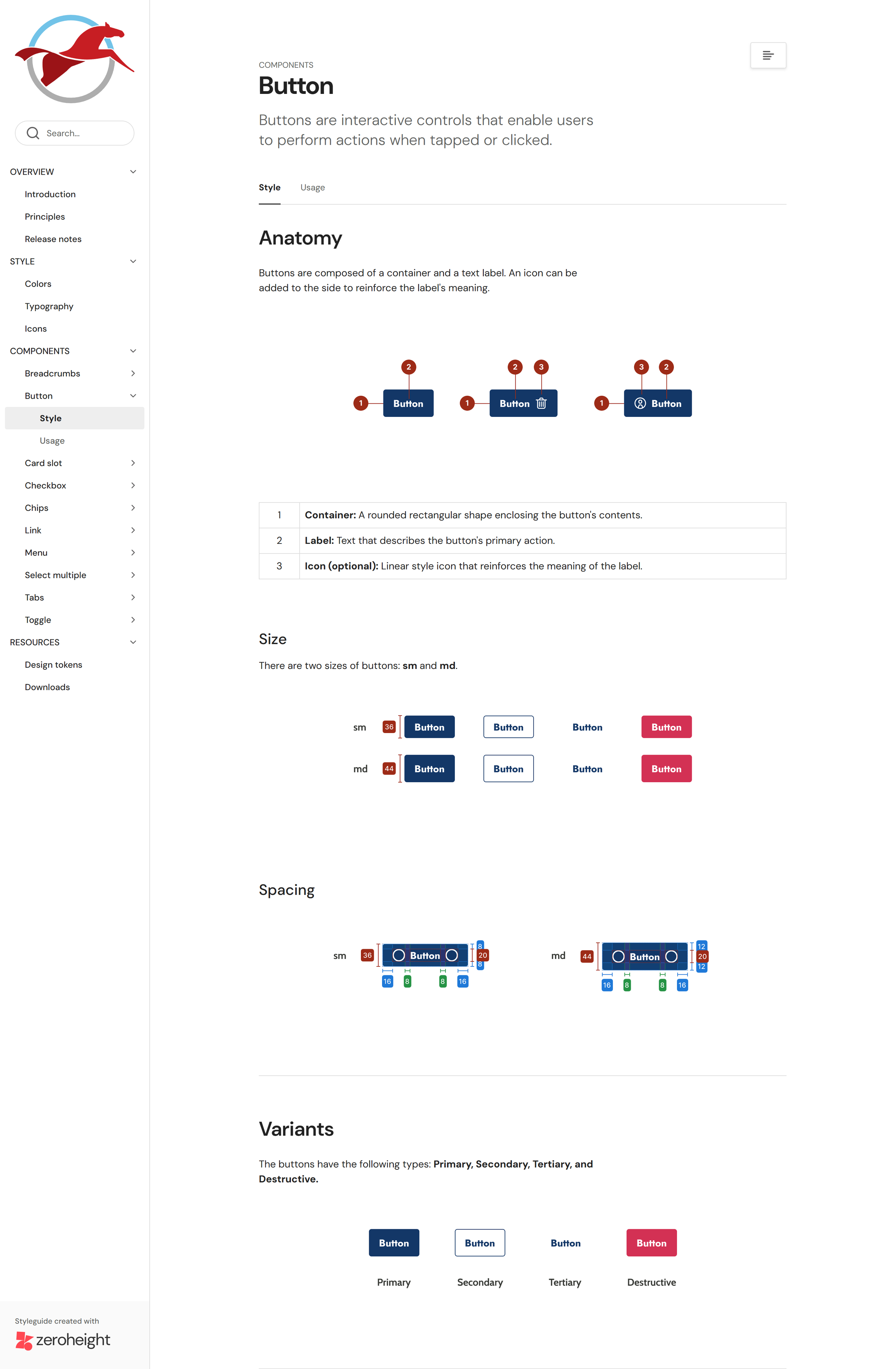
The Design System began with a clear set of design tokens and layout principles—type, color, spacing, grids, border radius, border width, and shadow levels—to drive consistency across the product.
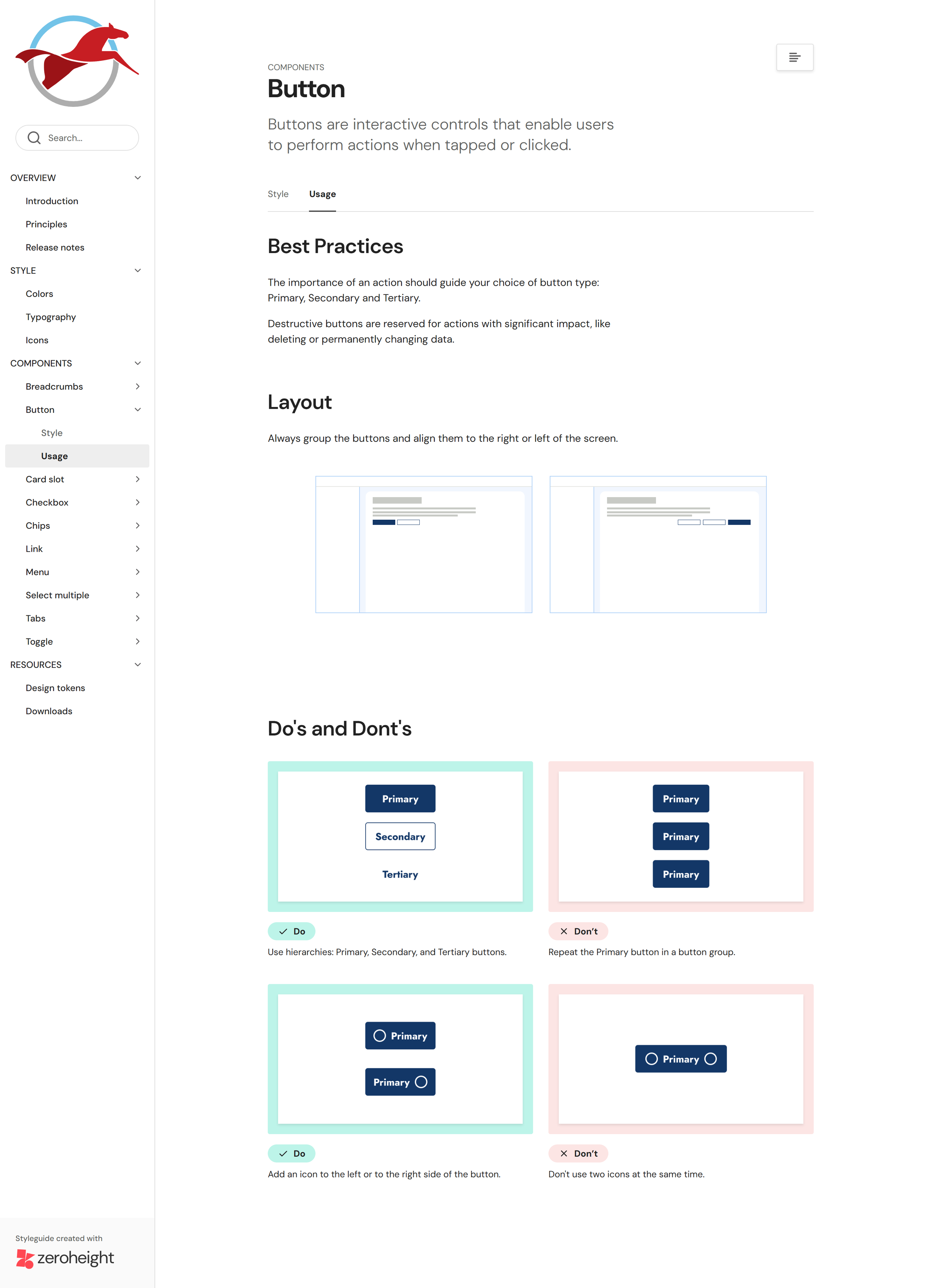
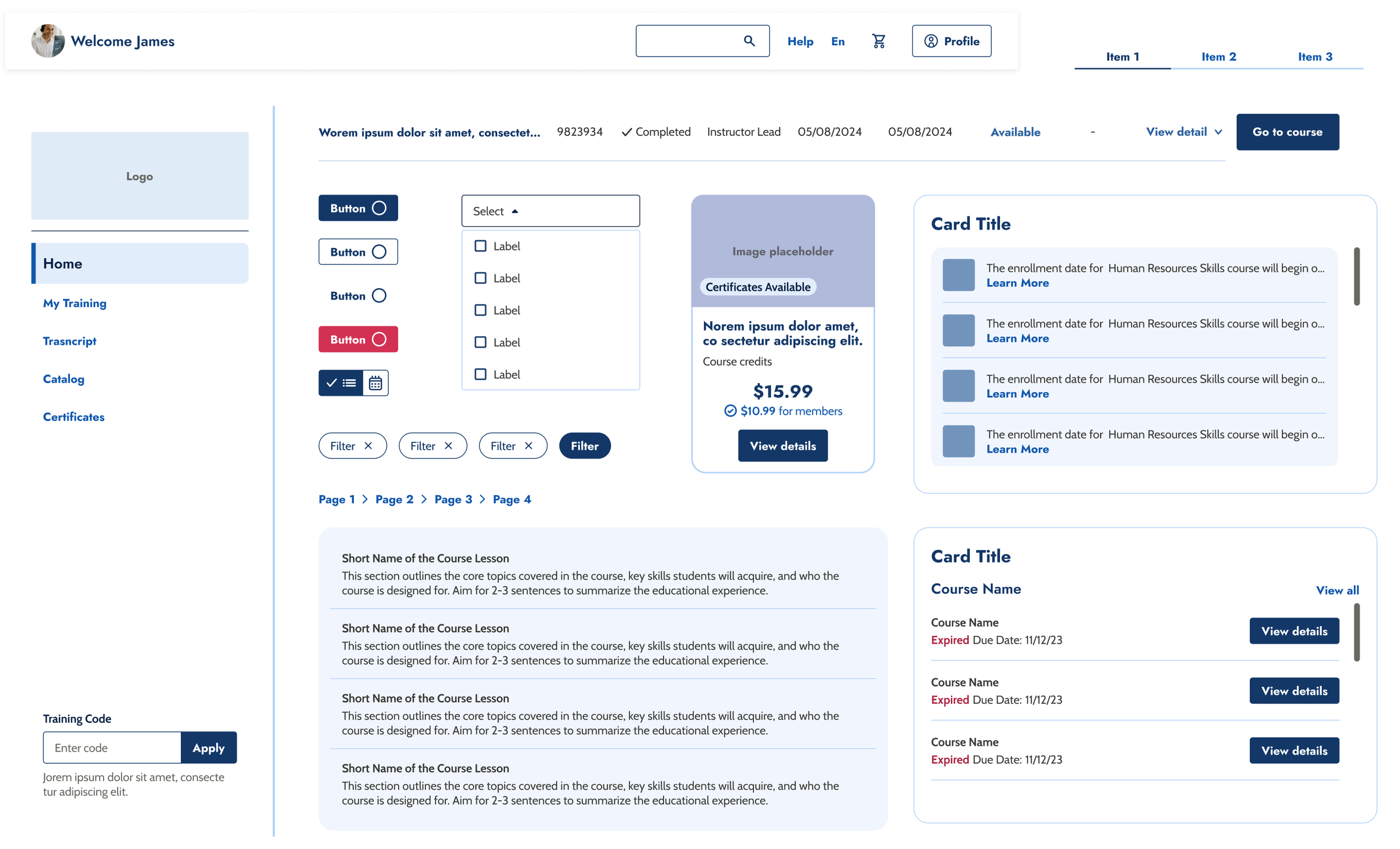
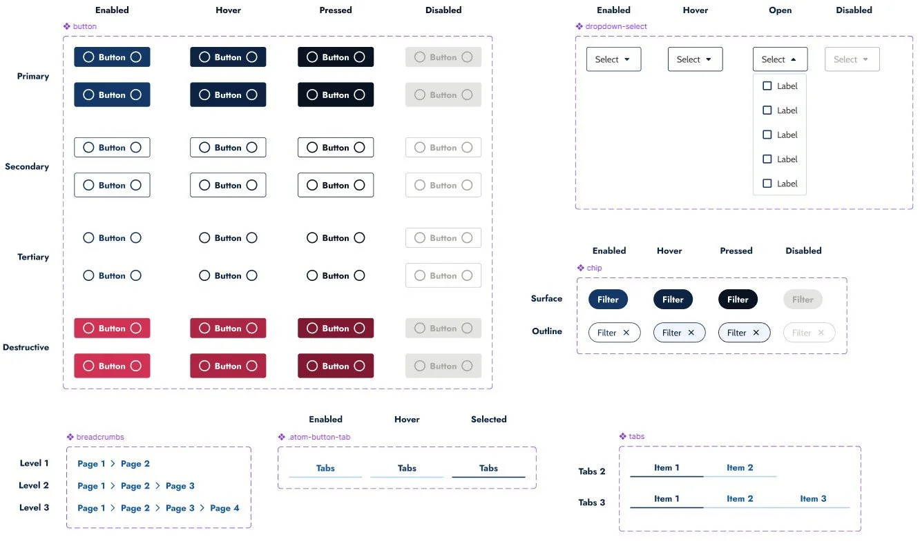
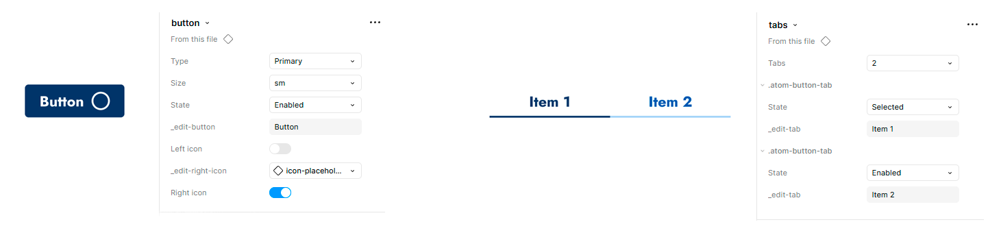
Components
We applied Atomic Design to ensure the Design System is both scalable and maintainable over time. Components were documented with their full range of states, and built with predefined, flexible properties to support quick customization.
Documentation
We created thorough documentation to keep component construction and usage consistent across the platform. It serves as a single source of truth, giving every team member the context they need to understand how the system works and how to apply it correctly.